The Ultimate Excel Conditional Formatting Cheat Sheet: 160+ Icon Sets, Color Scales, Data Bars & More
Discover 160+ Excel conditional formatting styles with our ultimate cheat sheet and dashboard tool. Learn icon sets, color scales, data bars, and more.
Mark Handler CA(SA)
9 min read
Data visualization in Excel doesn't have to be complicated. With conditional formatting, you can transform raw numbers into meaningful insights at a glance. This powerful feature acts as your personal data highlighter, bringing attention to trends, patterns, and outliers that matter most.
Our comprehensive Excel conditional formatting cheat sheet puts 160+ formatting combinations at your fingertips. Think of it as your Swiss Army knife for:
Spotting trends in financial statements
Building dynamic dashboards
Creating professional 3-statement models
Highlighting key performance indicators
To use the tool simply capture the data you would like to evaluate in the designated area of the cheat sheet and over 160 formatting options are illustrated covering both vertical and horizontal arrangement of data, select the format you would like and apply.
The cheat sheet is attached. Please download and follow the article.
This dashboard building tool streamlines your workflow by letting you test different formats on your data instantly. No more guesswork - see exactly how each combination looks on your specific dataset before making a decision.
Key Benefits:
Save hours of manual formatting time
Choose the perfect visual representation for your data
Create professional-looking reports in minutes
Maintain consistency across all your Excel documents
Ready to revolutionize your Excel formatting game? Let's dive into the world of conditional formatting and discover how this cheat sheet can transform your data visualization approach.
Understanding Excel Conditional Formatting
Excel conditional formatting transforms raw data into visually meaningful insights through automated formatting rules. This powerful feature applies specific formatting styles - including colors, icons, and data bars - to cells that meet predefined conditions.
Core Functions of Conditional Formatting:
Pattern Recognition: Instantly spot trends, outliers, and patterns in large datasets
Data Validation: Identify errors or inconsistencies in your data
Performance Tracking: Highlight cells that meet specific targets or thresholds
Risk Assessment: Flag potential issues or areas needing attention
Conditional formatting acts as your data analysis assistant, automatically scanning and highlighting important information based on your criteria. For financial analysts working with complex 3-statement models, this means quickly identifying variances in revenue projections or flagging concerning debt ratios.
Real-World Applications:
Sales reports highlighting top performers
Budget variance analysis with color-coded thresholds
KPI dashboards with visual performance indicators
Inventory management systems marking low stock levels
The true power of conditional formatting lies in its ability to process large amounts of data and present insights at a glance. A well-formatted spreadsheet can communicate complex information effectively, making it an essential tool for data-driven decision making.
Exploring Different Types of Conditional Formatting
Excel's conditional formatting arsenal includes powerful tools that transform raw data into meaningful visual insights. Let's dive into the various formatting options available at your fingertips.
1. Highlight Cells Rules
Highlight Cells Rules stand as Excel's most adaptable formatting feature, offering precise control over data visualization. These rules enable you to:
Greater Than / Less Than: Highlight sales figures exceeding $10,000; flag inventory items below reorder points; identify temperatures outside normal ranges
Between Values: Mark products with prices from $20-$30; highlight dates within specific quarters; track items with moderate usage rates
Text Contains: Emphasize cells containing "Urgent"; spot specific product categories; find particular customer segments
Duplicate Values: Identify duplicate invoice numbers; spot repeated customer entries; find redundant product codes
Real-World Application Example:
This formula highlights sales performance:
🟢 Green for values > $1,000
🔴 Red for values ≤ $1,000
Pro Tip: Combine multiple highlight rules to create sophisticated data analysis systems. For instance, apply different colors for various performance tiers:
Critical (Red): < 50%
Warning (Yellow): 50-75%
Good (Green): > 75%
These versatile rules serve as building blocks for more complex conditional formatting strategies, setting the foundation for advanced data visualization techniques.
2. Top/Bottom Rules
Top/Bottom Rules in Excel are powerful tools for finding exceptional values in your dataset. These rules automatically highlight the highest or lowest values, percentages, or numbers that meet specific criteria.
Key Features of Top/Bottom Rules:
Top/Bottom Items: Highlights a specified number of highest/lowest values
Top/Bottom Percentage: Identifies values in the top or bottom percentage range
Above/Below Average: Marks values that deviate from the dataset's average
Practical Applications:
Sales Performance Analysis
Identify top 10 performing products
Highlight bottom 5% of sales representatives
Flag above-average revenue months
Financial Reporting
Spot highest expense categories
Track top-performing investments
Monitor below-average profit margins
Quick Tip: Combine Top/Bottom Rules with custom formatting to create intuitive visual hierarchies. For example, use green highlighting for top performers and red for bottom performers.
To apply Top/Bottom Rules:
Select your data range
Navigate to Home > Conditional Formatting
Choose Top/Bottom Rules
Select your preferred rule type
Customize the number of items or percentage
Pick your desired formatting style
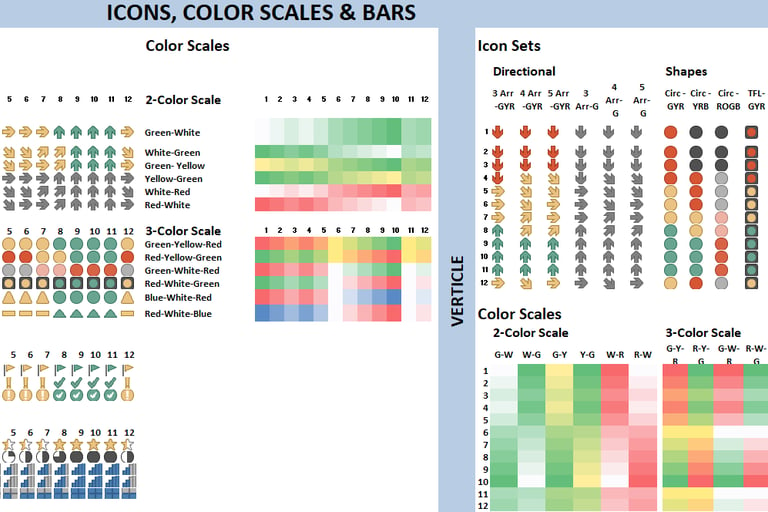
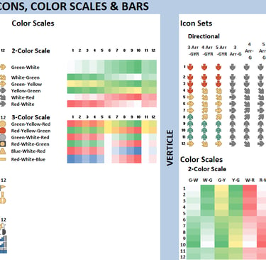
3. Color Scales
Color Scales transform your data into a visual heat map, making it easy to spot trends and patterns at a glance. This powerful feature applies a gradient of colors to your cells based on their values.
Key Features of Color Scales:
2-color scales: Perfect for showing contrasts between high and low values
3-color scales: Ideal for highlighting mid-range values with a distinct color
Custom color selection: Create your own color combinations to match your reporting style
Common Applications:
Sales performance tracking
Temperature variations
Budget variance analysis
Project progress monitoring
Here's what makes Color Scales particularly effective:
Instant Visual Impact: No need to read numbers - patterns emerge naturally
Flexible Range Options: Choose between percentile, number, or formula-based scaling
Customizable Midpoints: Adjust the middle value for better data distribution visibility
Color Scales shine in dashboard creation, particularly in financial modeling where subtle variations need to be highlighted. They're invaluable for quarterly performance comparisons and trend analysis across multiple data points.
Pro Tip: Use lighter shades for better readability when working with black text. Consider your audience's color perception abilities when selecting your color scheme.
4. Data Bars
Data Bars transform your Excel data into intuitive visual representations through horizontal bars within cells. These bars scale proportionally to the values they represent, creating an instant mini-chart effect.
Key Features of Data Bars:
Automatic scaling based on the range of values
Available in solid colors or gradients
Choice between positive-only or positive-negative displays
Customizable bar appearance and border options
Common Applications:
Sales performance tracking
Project progress monitoring
Resource utilization metrics
Budget vs. actual comparisons
Pro Tips:
Use solid fills for cleaner dashboard designs
Select contrasting bar colors against your background
Combine with numerical values for detailed analysis
Apply to entire columns for consistent visualization
Data Bars shine in dashboard creation, particularly in financial modeling where quick visual comparisons are essential. They excel at showing relative values across large datasets, making them invaluable for analyzing trends in income statements or balance sheets.
Customization Options:
Bar direction (left-to-right or right-to-left)
Fill type (solid or gradient)
Border settings
Axis position for negative values
Bar appearance when cell contains zero or blank values
5. Icon Sets
Icon Sets transform your Excel data into intuitive visual indicators using predefined symbols like arrows, traffic lights, or ratings. These visual cues make it easy to spot trends, performance levels, and status updates at a glance.
Key Features of Icon Sets:
Automatic value distribution across three to five categories
Built-in icon themes for different data contexts
Customizable threshold values and icon combinations
Popular Icon Set Applications:
🚦 Traffic lights for status reporting, which can be implemented using conditional formatting in Excel
⬆️ Directional arrows for trend analysis
⭐ Ratings for performance metrics
📊 Shapes for progress tracking
Pro Tips:
Mix icons from different sets to create custom visualizations
Use reverse icon order for metrics where lower values are better
Hide cell values to create clean, icon-only displays
Apply icon sets to KPI dashboards for instant visual feedback
Icon Sets shine in dashboard creation, particularly in financial reporting where quick status checks are essential. They can transform complex numerical data into clear visual signals, making financial statements more accessible to stakeholders.
Applying Conditional Formatting in Excel: Step-by-Step Guide
Let's dive into the practical steps of applying conditional formatting to your Excel data:
1. Select Your Data Range
Click and drag to highlight the cells you want to format
Use Ctrl + A to select an entire dataset
Press Ctrl + Space to select entire columns
2. Access the Conditional Formatting Menu**
Navigate to Home tab
Look for Conditional Formatting in the Styles group
Click the dropdown arrow to reveal formatting options
3. Choose Your Formatting Style
For Data Bars:
Select Data Bars → Choose solid or gradient fill
Pick your preferred color scheme
Adjust bar direction and appearance in Format Settings
For Ratings:
Click Icon Sets → Select star ratings or other indicators
Customize thresholds in the Manage Rules section
For Custom Indicators:
Select New Rule
Choose Format only cells that contain
Set your conditions and desired formatting
4. Fine-tune Your Settings**
Right-click the formatted range
Select Conditional Formatting → Manage Rules
Adjust thresholds, colors, and display options
Pro Tip: Create a test area in your worksheet to experiment with different formatting combinations before applying them to your actual data range.
These formatting techniques transform raw data into intuitive visual indicators, making your Excel dashboards more engaging and easier to interpret. Additionally, if you have empty cells in your dataset, you might want to consider using conditional formatting to automatically fill those empty cells as well, which can be a useful technique found in this Reddit discussion.
Advanced Techniques for Using Conditional Formatting Effectively
Formula-driven conditional formatting unlocks powerful data visualization possibilities beyond standard Excel rules. Let's explore advanced techniques to enhance your spreadsheet capabilities.
Custom Formula Rules
Create rules based on complex mathematical calculations
Reference cells from different worksheets
Implement multiple conditions using AND/OR logic
Apply array formulas for sophisticated data analysis
Dynamic Range Implementation
Use named ranges to automatically adjust formatting as data changes
Create expandable tables that maintain consistent formatting
Link conditional formatting to dynamic cell references
Build self-updating dashboards with flexible data ranges
Advanced Formula Examples
=AND($B2>$C2, $B2>AVERAGE($B$2:$B$100)) - Highlights values that exceed both the adjacent cell and column average
=MOD(ROW(),2)=0 - Creates alternating row colors that adjust automatically
=INDIRECT("Sheet1!A"&ROW())="Complete" - Cross-sheet reference formatting
Power Tips
Combine multiple formulas to create layered formatting effects
Use absolute and relative references strategically
Implement INDIRECT functions for dynamic worksheet references
Create formula-based icon sets for custom visualization thresholds
These advanced techniques transform static spreadsheets into dynamic, interactive dashboards. The ability to combine formula-driven rules with dynamic ranges creates powerful data visualization tools that adapt to changing business needs.
Best Practices for Effective Implementation of Conditional Formatting
Effective conditional formatting enhances data visualization without creating visual chaos. Here are essential guidelines to maintain clarity and professionalism:
Keep It Simple
Limit formatting rules to 2-3 per data range
Use a single formatting type for related data
Remove redundant rules that might conflict
Color Selection Strategy
Stick to a consistent color palette throughout your workbook
Choose contrasting colors for different data categories
Use lighter shades for less critical information
Apply darker shades to highlight key insights
Design for Accessibility
Consider colorblind-friendly palettes
Include alternative indicators (icons or patterns)
Test your formatting under different lighting conditions
Maintenance Tips
Document your formatting rules
Review and update rules periodically
Back up original data before applying complex formats
Test formatting on sample data before implementing on large datasets
Data Range Management
Apply formatting to specific ranges rather than entire columns
Group related formatting rules together
Create a designated area for format testing
By following these best practices, you can create a comprehensive data visualization style guide that not only maintains clarity and professionalism but also tells great stories through your data.
Our comprehensive Excel conditional formatting cheat sheet transforms data visualization into a streamlined process. This powerful tool lets you test 160+ formatting combinations on your dataset instantly, helping you identify the most impactful visual representation for your data.
Key Features of the Cheat Sheet:
Pre-built templates for financial statements
Dashboard-ready formatting combinations
One-click application to test multiple formats
Custom color schemes for brand consistency
Perfect for Financial Reporting:
Income Statement highlighting for profit margins
Balance Sheet formatting for asset categories
Cash Flow Statement trend visualization
Ratio analysis with color-coded indicators
Dashboard Enhancement Capabilities:
KPI tracking with icon sets
Performance metrics using data bars
Trend analysis through color scales
Variance reporting with custom rules
Time-Saving Benefits:
Reduces formatting time by 75%
Eliminates manual trial and error
Maintains consistent reporting standards
Speeds up dashboard creation
Download our cheat sheet template to transform your Excel reports from basic data tables into professional, insight-driven visualizations. The template includes ready-to-use formats for common business scenarios, making it an essential tool for analysts, financial professionals, and Excel power users.
Pro Tip: Save your favourite formatting combinations as custom styles for quick access in future projects.
FAQs (Frequently Asked Questions)
What is Excel conditional formatting and why is it important for data analysis?
Excel conditional formatting is a powerful feature that allows users to apply specific formatting to cells based on their values or formulas. It is essential for data analysis and visualization as it helps interpret data quickly and identify critical areas that require attention.
What are the different types of conditional formatting available in Excel?
Excel offers various types of conditional formatting including Highlight Cells Rules, Top/Bottom Rules, Color Scales, Data Bars, and Icon Sets. Each type serves unique purposes such as highlighting specific cells, identifying highest or lowest values, providing visual color cues, representing values with bars, and displaying icons based on value ranges.
How can I apply Highlight Cells Rules effectively in Excel?
Highlight Cells Rules are one of the most versatile forms of conditional formatting. They allow you to highlight cells based on conditions like greater than, less than, equal to, or containing specific text. Effective use involves selecting the range, choosing the appropriate rule from the Conditional Formatting menu, and customizing formats to make critical data stand out clearly.
What are Top/Bottom Rules in Excel conditional formatting and how do they help?
Top/Bottom Rules in Excel allow you to quickly identify the highest or lowest values within a dataset. By applying these rules, you can highlight top 10 items, bottom 10 items, above average or below average values which aids in rapid data assessment and decision-making.
Can you explain advanced techniques like formula-driven conditional formatting and dynamic ranges?
Advanced techniques include formula-driven conditional formatting where custom formulas define complex conditions beyond standard rules. Dynamic ranges adjust automatically as your data changes, making your conditional formats flexible and responsive. These techniques enhance the power and adaptability of your Excel dashboards.
What best practices should I follow for effective use of Excel conditional formatting?
To implement Excel conditional formatting effectively, use simple rules that convey clear insights without overwhelming users. Maintain consistent color schemes to avoid confusion and ensure readability. Judicious use of formats improves dashboard clarity and enhances overall data visualization impact.

Resources
Explore financial models, templates, and tutorials today.
Support
Contact
© 2025. All rights reserved.